Cover Makeovers: What YA Book Wore It Best?
⚓ Books 📅 2025-08-21 👤 surdeus 👁️ 21

Covers market a book, and despite the saying, we judge our books by them. We have to—in a world saturated with things trying to get our attention, a book cover is designed to both appeal to a reader and sell its contents to the appropriate reader. Historically, covers carried less weight than they do now, especially in the YA market. Libraries and schools would typically purchase hardcovers, so the designs for them didn’t need to necessarily attract the teenager at the bookstore. That was more frequently saved for paperback editions which came at a lower price point for the teen market.
Again, that’s historically. It hasn’t necessarily been that way for a long time, as more teens are purchasing hardcovers and libraries and schools don’t necessarily only purchase hardcovers (a tight budget, even with a jobber’s discount, would stretch to two paperback YA books vs. one hardcover). It’s not surprising that we might see cover changes between a hardcover edition of a title and its paperback; it’s also not surprising that we might see historically popular titles republished with fresh, contemporary covers to appeal to today’s teens.
Let’s take a peek at a handful of YA books that have recently gotten a little facelift in their paperback editions. I’ve done my best to credit cover designers, but as has been the regular drum I beat, it’s not easy to find this information without the book in front of you. It should be, but it is not. It’s also difficult to track down this information when the change is only indicated in a publisher catalog–many of these haven’t started to make their way onto social media or other media outlets yet. Here’s my regular plea for publishers to put that right on their landing pages for the book.
Note: most of the books discussed here are by white authors. That’s not reflective of YA as a whole but rather, looking at a very specific subset of YA books which have had cover redesigns.
First up, a YA book celebrating a milestone anniversary with a new look.
Wither by Lauren DeStefano / “The Chemical Garden” Trilogy
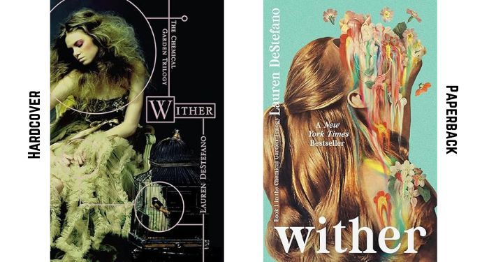 |
It is mind-boggling to me that Wither by Lauren DeStefano came out 15 years ago as of January 2026. I remember the flurry of excitement and buzz for it at Book Expo America back in the day. The cover was a unique concept then, taking the “girl in a pretty dress” to a little bit of a different place. The lines and circles gave the cover a feel that was a little less romantic than many peer books at the time.
All three books in the trilogy are getting makeovers for the anniversary, and all take a similar approach to the paperback above. They’re colorful, hyper-saturated designs wherein the girl’s face is covered in melting flowers. Here’s the look for Fever and for Sever. First printings will have stained edges, and the content for each of the books have been updated slightly by the author.
In terms of which cover design is better, both are very much of their era. The originals look like the books being published in 2011. The new look appeals to the aesthetics we’re seeing on YA in this genre now. The new cover designs are going to have more appeal on social media than the originals, though, which is probably intentional. The original covers are a little dark and hard to read on screen as thumbnails, whereas the new covers pop. I do suspect the repackaging will introduce the series to a whole new readership.
Dark Dude by Oscar Hijuelos
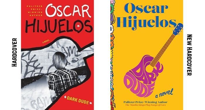 |
When Dark Dude by Oscar Hijuelos went from its 2008 hardcover edition, pictured above, to its 2009 paperback cover, there was a design update. You can see the original paperback look here. The original cover is striking for several reasons, including its use of graffiti for the author’s name, as well as the image inside the outline of a guitar. The red pops on shelves, too, and it definitely did in the era when the book was released.
But it’s not a perfect cover. One of the biggest weaknesses is that the title is so tiny it is hard to read.
The new, refreshed cover for the book–which releases on the 26th of this month–brings the story into design trends of today. What is especially savvy is that the guitar returns (it had disappeared in the original paperback), and though the size of the font still feels small, creating the guitar out of the title of the book is clever. Like its original hardcover, the color palate here is striking as well.
Both covers are strong, but today’s readers will likely really gravitate toward the newer look.
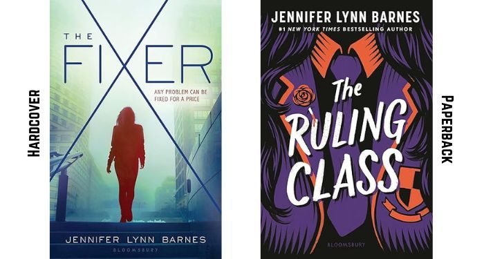
The Fixer by Jennifer Lynn Barnes / “The Fixer” series
 |
Jennifer Lynn Barnes has become such a well-known name in YA, thanks to the success of her more recent book series. But did you know she’s been publishing YA since 2006, when she was only 19? She has.
One of her duologies, The Fixer, published in 2015 and 2016. Those two books are getting new looks in paperback, along with fresh titles. You can see the cover for The Fixer, book one, on the left. It’s…fine. It doesn’t really tell much about the book at all, though it does come with the tag line “Any problem can be fixed for a price,” so you have a little bit of an idea of what the person on the cover is about to do.
The paperback redesign for The Fixer has been given the title The Ruling Class, and it leans into the illustration-forward cover design aesthetic that have defined the 2020s in YA. What makes this cover stand out and speak for the book is that you know it’s going to have something to do with an elite institution, thanks to the visible crest being worn on what looks like a uniform jacket. There’s a clever little drop of blood going on here, too, right about the “U” in Ruling, and Barnes’s name has far more prominence than the original–now being a #1 New York Times Bestselling Author doesn’t hurt.
The art isn’t perfect, as the hair seems to be landing on the body in an unnatural way, likely due to a lack of head or face to offer proportionality. But the color scheme, the larger title, and the overall design give the redesign real edge. This will likely help introduce new readers to Barnes’s work and allow dedicated fans to dive into her backlist, as the new covers evoke the same genre/feel/vibe of her “Inheritance Games” series (from a different publisher than “The Fixer” series).
New covers for this duology hit shelves September 2. I don’t know why the designer or artist weren’t credited in the social media pushes for it.
Also, expect to see more new cover designs from across Barnes’s career. “The Squad” series is getting them soon, too.
Lies You Never Told Me by Jennifer Donaldson
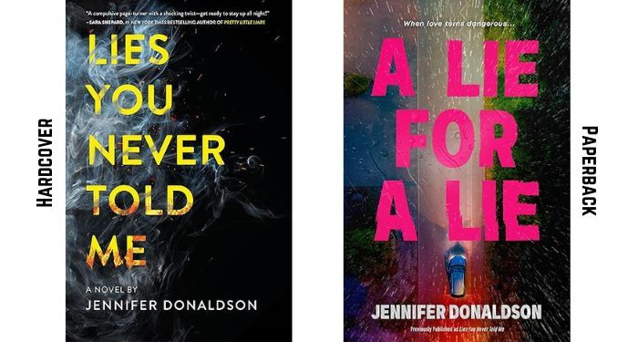 |
If you’re looking for another example of a book cover going through several transformations, look no further than this one. Jennifer Donaldson’s Lies You Never Told Me published in 2018 with the hardcover look on the left. It then got a new look in paperback in 2019, which you can peep here:
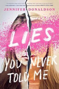
Fast forward to April 2026, and the book not only has a new cover–which seems to meld both the hardcover and paperback covers from before–and it has an entirely new title, A Lie for a Lie.
This cover redesign is a bit baffling, as is the title change. The original title conveys that this is a thriller, and in this era of voracity for thrillers, this seems like it would grab readers. The new title doesn’t change much, though the meaning of the title seems to convey something else entirely. Is this about lies not being told? Or is this about lies being exchanged back and forth?
In either case, neither the original covers nor the new covers suggest this is actually a work of dark contemporary romance.
The new cover, as mentioned above, seems to meld the original two covers. You’ve got the darker palate of the hardcover, with the split-in-the-middle image from the paperback. There are no longer blurbs on the new cover, though. What we get instead is maybe the most helpful part of the cover, a tagline reading “When love turns dangerous…”.
You can pick up the new cover and title for Donaldson’s novel on April 7, 2026.
Old Wounds by Logan-Ashley Kisner
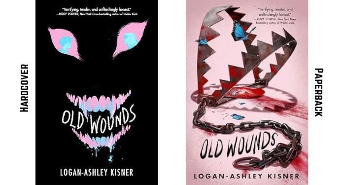 |
Let’s end on this note: both the hardcover and paperback editions of Logan-Ashley Kisner’s Old Wounds are amazing. The paperback takes all of the best pieces of the hardcover and transforms them. The hardcover perfectly states that this is a work of trans horror, and the paperback uses the trans colors in a creatively subversive manner.
They’re both perfect covers. That the same team did them both shows, and they’ll both appeal to the book’s readership. (If I were picking one for me, I’d go with the bloodier one, but that’s all preference!).
Old Wounds hits shelves in paperback September 9.
🏷️ Books_feed