Iced GUI: Two scrollable columns overlapping despite using FillPortion(1) in a Row
⚓ Rust 📅 2025-11-28 👤 surdeus 👁️ 22

Hi everyone,
I'm building a desktop application with Iced (v0.13) in Rust, and I'm having a layout issue that I can't seem to resolve.
I want to display two side-by-side scrollable text panels (e.g., for showing diagnostic mask definitions), each taking up half the available horizontal space. I’m using:
- A
Rowcontaining twoscrollablewidgets - Each
scrollablewraps aColumnoftextelements - Both are set to
.width(Length::FillPortion(1)) - The parent
Rowhas.width(Length::Fill)
However, instead of appearing side by side, the two scrollables visually overlap, making the content unreadable — as if they’re rendered on top of each other, even though their data is different.
Here’s a simplified version of my layout code:
{
                let title = text("诊断掩码识别助手").font(Font::with_name("Microsoft YaHei"))
                    .width(Fill)
                    .size(25)
                    .style(subtle)
                    .align_x(Center);

                let text_input_component = text_input("回车键用以添加任务", state.input_value.as_str())
                    .id("new_task")
                    .on_input(Message::InputMaskChanged)
                    .on_submit(Message::CreateDiagMaskTask)
                    .padding(10)
                    .size(20)
                    .width(Fill) // 👈 输入框撑满
                    .align_x(Center);


                let icon_image = Image::new("images/icons/diag_search.png").width(40).height(40);
                let input_and_search = Row::new()
                    .push(text_input_component)
                    .push(
                        button(icon_image)
                            .on_press(Message::SearchDiagMask(state.diag_mask_task.clone()))
                            .style(button::primary)
                            .width(40)
                    )
                    .spacing(8)
                    .width(Fill)
                    .align_y(Center);

                let controls = view_controls(&*state.diag_mask_task, state.filter);
                let filtered_tasks = state.diag_mask_task.iter()
                    .filter(|task| state.filter.matches(task));

                let tasks: Element<_> = if filtered_tasks.count() > 0 {
                    keyed_column(
                        state.diag_mask_task.iter()
                            .enumerate()
                            .filter(|(_,task)| state.filter.matches(task))
                            .map(|(i,task)| {
                                (
                                    task.id,
                                    task.view(i)
                                        .map(move |msg|Message::DiagTaskMessage(i, msg))
                                )
                            }),
                    )
                        .spacing(10)
                        .into()
                }else{
                    empty_message(match state.filter{
                        Filter::All => "You have not created a task yet...",
                        Filter::Active => "All your tasks are done! :D",
                        Filter::Completed => "You have not completed a task yet...",
                    })
                };

                let main_content = Column::new()
                    .push(button("Return MainMenu").on_press(Message::Exit))
                    .push(title)
                    .push(input_and_search)
                    .push(controls)
                    .push(tasks)
                    .spacing(20)
                    .width(Length::Fixed(320.0))
                    .align_x(Center);

                // let content = column![title,input_and_search,controls,tasks]
                //     .spacing(20);
                //     //.max_width(800);
                let adaptation_text = fs::read_to_string("./example_doc/adptation_mask.txt")
                    .unwrap_or("adaptation_mask file non-exist".to_string());

                let adaptation_mask_scroll = scrollable(column![
                    text(adaptation_text.clone()).font(Font::with_name("Microsoft YaHei"))
                ]).width(Length::FillPortion(1));


                let qwen_mask_scroll = scrollable(column![
                    text(r"Qwen 特殊掩码\n0x00000A: 模型加载\n0x00000B: 参数同步\n0x00000C: 状态上报").font(Font::with_name("Microsoft YaHei"))
                ]).width(Length::FillPortion(1));

                let layout_context = Row::new()
                    //.push(main_content)
                    .push(qwen_mask_scroll)
                    .push(adaptation_mask_scroll)
                    .spacing(20)
                    //.width(Shrink);
                    .width(Length::Fill);

                let layout = Row::new()
                    .push(main_content)
                    .push(layout_context)
                    .spacing(40);

                column![
                    layout
                ]
                    .spacing(20)
                    .width(Fill)
                    .align_x(Center)

            }
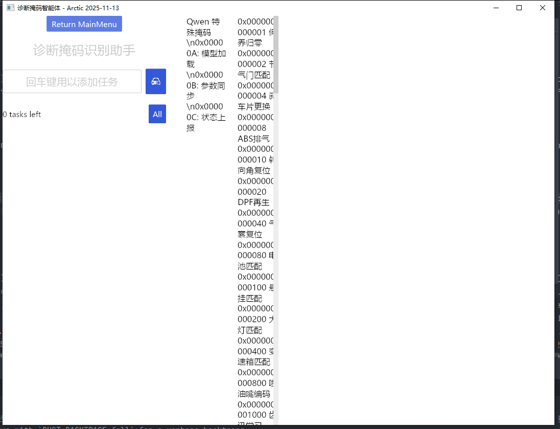
![]() What I’m Looking For
What I’m Looking For
Suggestions for layout structure
Ideas for visual hierarchy: how to make the AI response stand out as the primary content
Recommendations for typography, spacing, or theming in Iced
Whether to add features like copy-to-clipboard, response formatting, or expand/collapse sections
Note: I’m using iced = "0.13" with custom fonts (Microsoft YaHei) and basic theming.
Any design principles, mockups, or even rough sketches would be incredibly helpful!
1 post - 1 participant
🏷️ Rust_feed